The Shapes of Borges’s Writing
April 5th, 2018
The study of a corpus of Borges’s manuscripts covering more than 50 years of writing and multiple genres led to the development of a taxonomy of his writing styles or Hands. This essay presents the Borges’s Hands and reflects on salient particularities of his writing hand.
The work is based on the study of 20 poetry and short prose manuscripts by Jorge Luis Borges, ranging from his earliest poems published in Fervor de Buenos Aires in 1923 to texts of the mid 1960s —when he becomes blind—, dictated to his mother and, thus, in her handwriting. Five writings hands, including his mother’s by substitution, are identified and described.
The corpus of manuscripts in the study includes: 1. Calle desconocida, 1919, 1920, 1922, 1943 (at the Small Library, University of Virginia); 2. Trincheras, 1920, 1923 (at the Small Library, University of Virginia); 3. Rusia, 1920, (at the New York Public Library); 4. Judería/Judengasse, 1920, 1922, 1942 (at the Small Library, University of Virginia); 5. Nostalgia inescrutable/Ciudad, 1920, 1923 (at the Small Library, University of Virginia); 6. Intentona de soneto, 1923 (at the Small Library, University of Virginia); 7. Villa Mazzini/Villa Urquiza, 1926 (at the Small Library, University of Virginia); 8. La vuelta a Buenos Aires, 1926 (at the Small Library, University of Virginia); 9. Boletín de una noche, c. 1926, (at the Small Library, University of Virginia); 10. La fundación mitológica de Buenos Aires: 1926, 1927, 1929 (at the Small Library, University of Virginia); 11. A la doctrina de pasión de tu voz, 1927, (at the Small Library, University of Virginia); 12. Third English Poem, unpublished poem, c.1934, (private collection); 13. Homenaje, 1936, (at the Small Library, University of Virginia); 14. 14. A mi padre, unpublished poem, 1938 (at the Small Library, University of Virginia); 15. Las calles, 1923, 1951 version of poem from Fervor de Buenos Aires (at the Small Library, University of Virginia); 16. La Plaza San Martin, 1951 copy of a poem from 1923 (at the Small Library, University of Virginia); 17. Mateo XXV, 30: 1953 (one copy at the new York Public Library, and another version at the Harry Ransom Center, University of Texas); 18.Una rosa amarilla, c. 1956 (at the Harry Ransom Center, University of Texas); 19.Susana Soca, typescript, 1959 (at the Small Library, University of Virginia); 20.Elegía/Milonga de Jacinto Chicana, 1965, in Borges’s mother’s hand, (at the Small Library, University of Virginia)
 HAND A. Early 1920s. A section from “Trincheras” 1920, 1923, [21 x 32 cm] at the Albert and Shirley Small Library, University of Virginia
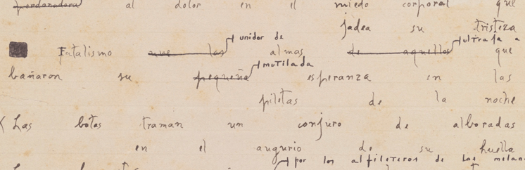
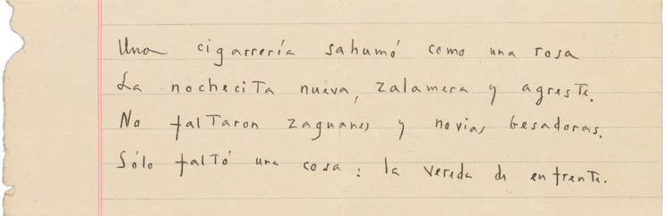 HAND B. Mid 1920s. A section from “La Fundacion Mitológica de Buenos Aires” 1926, 1928, [17 x 22 cm] at the Albert and Shirley Small Library, University of Virginia
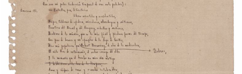 HAND C. Late 1920s onward. A section from “Mateo XXV,30” 1953, [17 x 22 cm] at the Harry Ransom Center, University of Texas
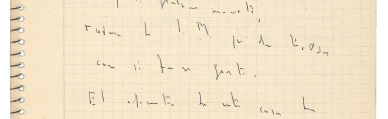 HAND D. Mid-late 1950s. A section from “Una Rosa Amarilla” 1956, [17 x 22 cm] at the Harry Ransom Center, University of Texas
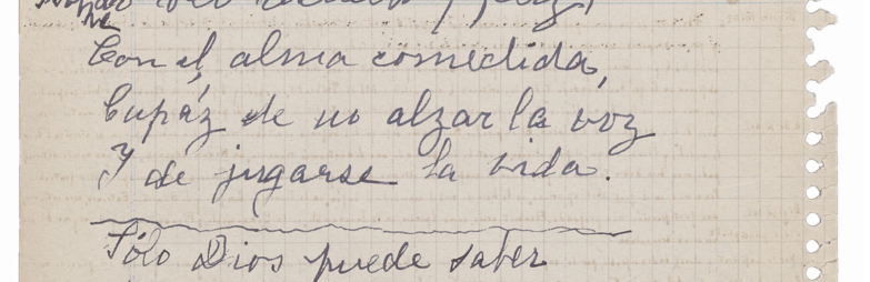 HAND E. A section from “Milonga de Jacinto Chicana” 1965, [17 x 22 cm] at the Albert and Shirley Small Library, University of Virginia
The presence of these different hands in the manuscripts is not exclusive. The early manuscripts in Borges’s cursive hand (Hand A) are annotated in Borges typically diminutive hand (Hand C). This doesn’t necessarily indicate that he maintained both hands and used them differently; the re-signing of the poems at later dates suggests that he is revising poems years later, when the smaller hand became prominent. In the case of Calle desconocida, Judería and Nostalgia inescrutable, we can see two types of revisions, some contemporary to the initial writing (Hand, in the same hand if sometimes smaller, and another round of revisions done years later in the typically small writing of Hand C.
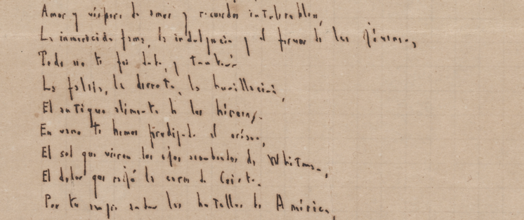 Letras T. Detalle de “Mateo XXV, 30” 1953
A particularity of Borges’s writing is how he structures the letter t. In the early manuscripts corresponding to Hand A, he writes typical lowercase t, that is, he crosses the stem of t with a horizontal stroke that extends before and after the vertical one. We can also see, particularly in the larger print hand (Hand B) of manuscripts like Rusia, Villa Mazzini and Intentona de Soneto, a tendency towards crossing the t high on the stem, in a way that it barely touches it and if so only from the stem to the right and not across proper. I consider this to be a transitional form of the lowercase t becoming an uppercase T. The most prevalent form of the T is that of an uppercase structure and it is seen primarily in the manuscripts of his main hand (Hand C). Even though grammatically, Borges’s means a lowercase t, the structure he writes is that of an uppercase letterform. In many cases the T is small in stature and thus blends better with the rest of the lowercase letters in a word, what in typographic terms would be a small capital, a smaller version of an uppercase letter designed to blend well in the fabric of lowercase text. In poems like the second version of Mateo XXV,30 Borges’s does differentiate between uppercase T and lowercase t by adding serifs to the crossbar of the T, a treatment that will be standard in his essay and short story manuscripts. In a number of cases Borges uses lowercase ts and uppercase Ts in the same document to signal a grammatical lowercase t; the first version of Mateo XXV,30 at the New York Public Library includes the three forms of the letter t, lowercase t, uppercase T as lowercase, and the grammatical uppercase T differentiated from the latter through the use of serifs.